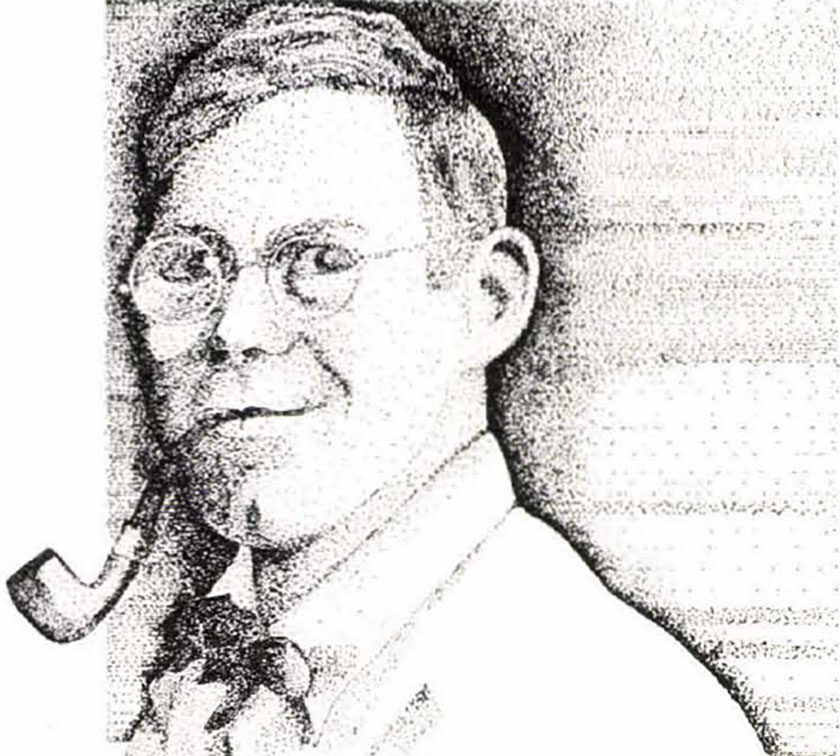
Nine wildlife artists talk about their favorite media — including tools of the trade — that have helped them earn nationwide acclaim.
Watercolor by Morten E. Solberg
Of all the painting media, watercolor has been around the longest. The first crude paintings on cave Walls in France and Spain were done in a form of watercolor, and it was used by Egyptian artists in the Second Century A.D. Watercolor has attracted artists down through the ages because it is a durable and lasting medium. Michelangelo painted the ceilings of the Sistine Chapel in watercolor.
In my lifetime, I have seen watercolor paintings command greater prices than I ever imagined possible, which illustrates how the medium has come into its own in America. Winslow Homer was acclaimed during his lifetime as an oil painter. He is noted as saying that he would be remembered as a watercolorist, which came to be fact. Prior to Homer’s contribution to the art world, watercolor was known as a sketch medium and not fine art of itself. Homer’s influence was passed onto the likes of Andrew Wyeth. In this century, Wyeth brought the appreciation of watercolor to the average person through his subject matter and style.
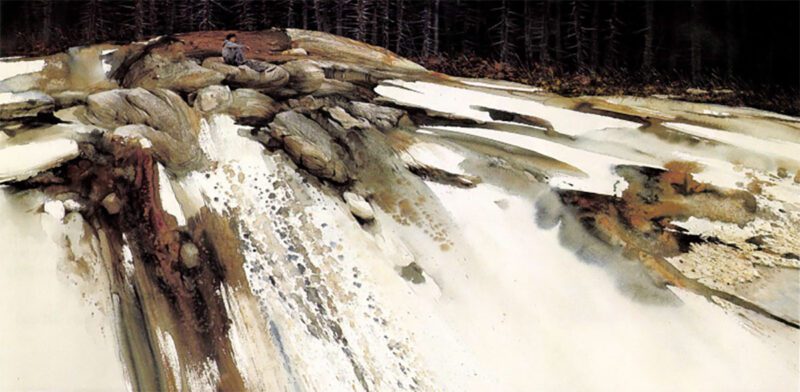
Virgin Waters, watercolor by Morten E. Solberg
I have worked in most media during my lifetime, and I have found that watercolor gives me the freedom of self-expression that no other medium does. In high school, I tried watercolors for the first time and found them incredibly exciting. The fact that the colors would blend with such ease and with a certain unpredictability was amazing to me. I am still in awe of this phenomenon, even after 40 years of working in the medium.
When more than one color is applied to the paper surface or when water is applied to already existing colors, spontaneous “accidents” occur. I love these “accidents” and use them to my advantage. I have worked with watercolors at both extremes: uncontrolled spontaneity and tight realistic rendering. I prefer the spontaneous because it is easier to express my feeling with a loose and free approach. I also like to experiment and learn and grow. Watercolor’s illusive qualities provide an endless source of challenge.
Acrylic by James A Meger
Acrylic, the “plastic paint,” has been called the most important artistic medium developed in the 20th century Acrylic has a consistency similar to that of oil paint and is extremely versatile. It can be mixed with water or acrylic mediums to obtain consistencies varying from thick impastos to watercolor washes.
Acrylic and oil are made up of three basic elements: pigment, adhesive and solvent. Pigment is the ground color, and this is where both oil and acrylic use similar ingredients. The adhesive, or vehicle, binds the paint together and sticks it to the painting surface. In oil paint, linseed oil typically serves as the adhesive; in acrylic, it’s a liquid plastic. The solvent used to keep oil paint fluid is turpentine (or oil-based thinners), while water is the. Solvent for acrylic. Once the acrylic is fully dried, the solvent effect of the water is lost.
Painting technique varies considerably between the two mediums. Oil has a wonderful blending capacity and creates rich, resonant colors. Its slower drying time allows ample opportunity for blending and manipulation. In addition, its colors remain the same, wet or dry To some, acrylic doesn’t seem to have that same character or color and richness. Also, value or darkness of the color changes from wet to dry. At first glance, these may seem like major drawbacks. However, the one great difference is in drying speed — minutes for acrylics, while oil can take days or even weeks.
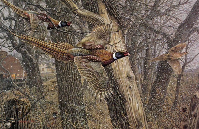
Storm Warning – Ringnecked Pheasants, acrylic by James A. Meger.
With my style of painting, I don’t have a preconceived notion for every element in my paintings — often I will restructure or redraw the entire composition halfway through the painting. With oil, this reworking would pose a major problem, but with acrylic, I simply sand off the unwanted passage and paint right over it.
For years I worried about the archival properties of acrylics, but according to extensive testing, it may be the most durable medium ever developed. Oil has a tendency to darken and crack, but the first acrylic paintings from the1950s show remarkable brilliance and freshness. As to the overall look of an acrylic painting as compared to one in oil, the proof lies with the people at shows who constantly ask me, “Do you use oil or acrylic?”
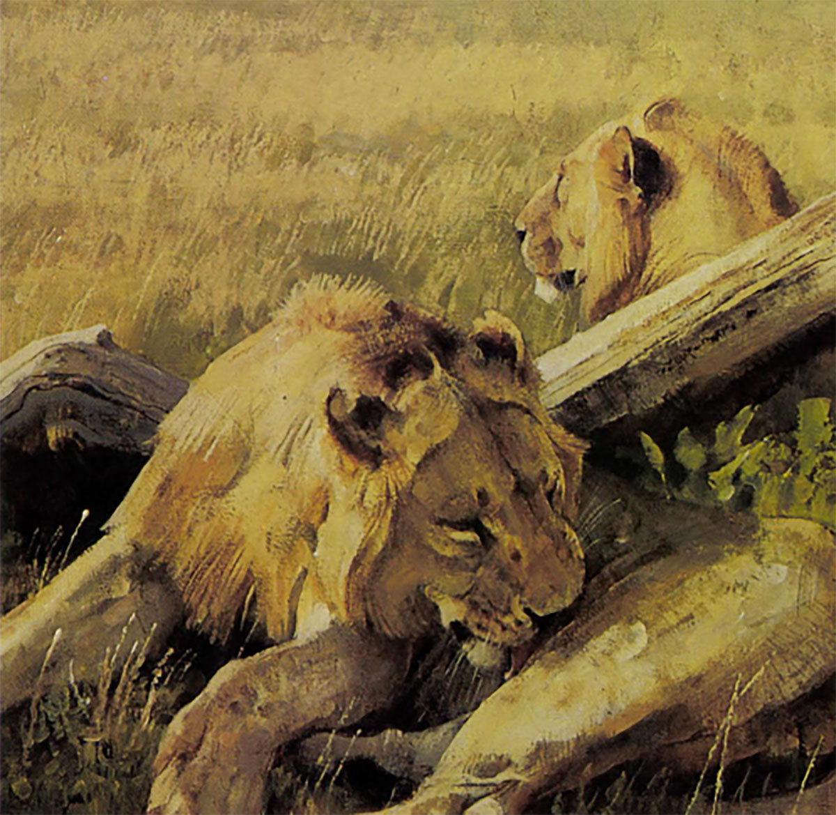
Oil by Simon Combes
Oil paint first captured the hearts of artists in 15th-century Flanders, then quickly caught on with the great Italian masters. Today, it is probably the most popular medium worldwide.
My first-ever commission, which was more of a challenge than a serious order, required a painting of a Masai warrior in oils. That is how I started using oils. Through trial and error, reading books and listening to advice from fellow painters, gradually and sometimes painfully, I taught myself.
Throughout this process, which is still on-going, two principles have stuck in my mind.
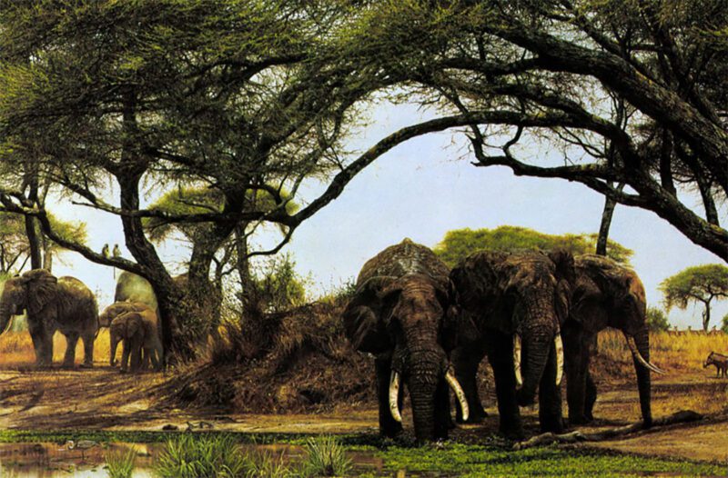
The Watering Hole, oil painting by Kenya artist Simon Combes (detail 2).
First, simplicity. I use a very limited palette, seldom more than six basic colors. Predominantly, my work involves animals and landscape. In that context, simplicity is of the essence. For instance, a sun-dried plain and all the animals in it can be painted using the many combinations of ocher, yellow and sienna. Too many fancy color tones will rob the painting of its atmosphere and accuracy.
Second, to maintain color purity, I use paint straight from the tube, not employing any thinner except distilled turpentine when I am putting on the first rough coat. I tend to mix my palette beforehand instead of as I go along, then work the paint on the canvas while it is still wet in order to achieve texture. If I use a thinner, I find that my colors lose their purity, and blend to give a muddy effect.
I enjoy oils because they are robust and flexible. Recently, I carried an eight-foot-long finished canvas in the back of a truck over 100 miles of dusty Kenya roads. On reaching Nairobi I was able to wash off the dirt with a sponge and mild detergent. Canvasses can be rolled for transportation and colors can be scraped off or painted over if I make a mistake.
Gouache by Guy Coheleach
“Gwash,” as it is usually pronounced, is an opaque pigment paint that is ground in water and held together with gum. Because of its opacity, it is an excellent medium when exacting detail is needed. For example, painting finely detailed whiskers over an animal’s darker face is much more easily handled by using an opaque white rather than leaving the hairs to be shown as pure white background paper. That would be the way I would normally work with pure transparent watercolors.
The first wildlife art I did professionally was almost exclusively scientific in nature and as such, required very accurate detail. I found I could get finer rendering with gouache and watercolor compared to acrylic, oil or pastel.
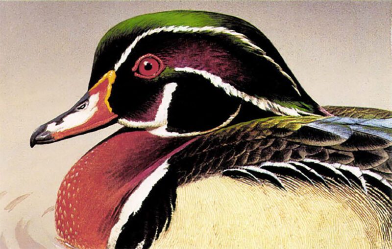
Wood Duck, gouache by Guy Coheleach.
I seldom use gouache anymore, preferring the freedom and spontaneity of oil and watercolor. However, when I must paint with greater detail, such as when I’m doing a painting for the print market, I will use acrylic because it covers better than gouache. Still, acrylic does not provide me with the fineness of detail afforded by gouache.
In this gouache painting of a wood duck, one can readily see the degree of detail which I would find great difficulty in matching with any other medium. I can’t even imagine painting watercolors in and around the white areas as I would with transparent watercolor, so gouache was the simple solution to this problem.
Pencil by Lindsay B. Scott
I enjoy working in pencil because of the mood and drama that can be created with the medium and because of its simplicity. Pencil is unique because the artist can achieve every fine gradation of tone. Tones are built up gradually by applying layer upon layer of pencil strokes, which also create a wonderful texture.
Pencil is very demanding and unforgiving, however. There is very little room to change things once a piece is started, so before I start the final piece, I plan my work down to the last detail. It is especially important to identify the “white” areas, as they must be kept pristine. You can’t erase to create a white area because it would leave a noticeable smudge and damage the paper surface.
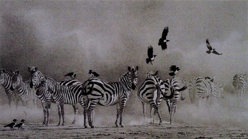
Dust Storm – Zebras, pencil by Lindsay Scott
Pencil is demanding in other ways as well. Creating a piece of art in black and white is challenging because you cannot use color as a “crutch” to make a piece interesting. The composition has to be good, as does the use of tone (lights and darks). When working in pencil, your use and understanding of light is very important; otherwise your drawing will look flat and uninteresting.
Though artists and draughtsman have been using pencil for centuries, only recently has it been gaining recognition as a fine art medium. I also paint in oil, but find that most of my clients want my pencil work. For the past seven years my drawings have been accepted into the Leigh Yawkey Woodson Art Museum’s “Birds in Art,” one of the most prestigious shows in the country. The museum purchased one of my drawings for their permanent collection.
Scratchboard by Alderson Magee
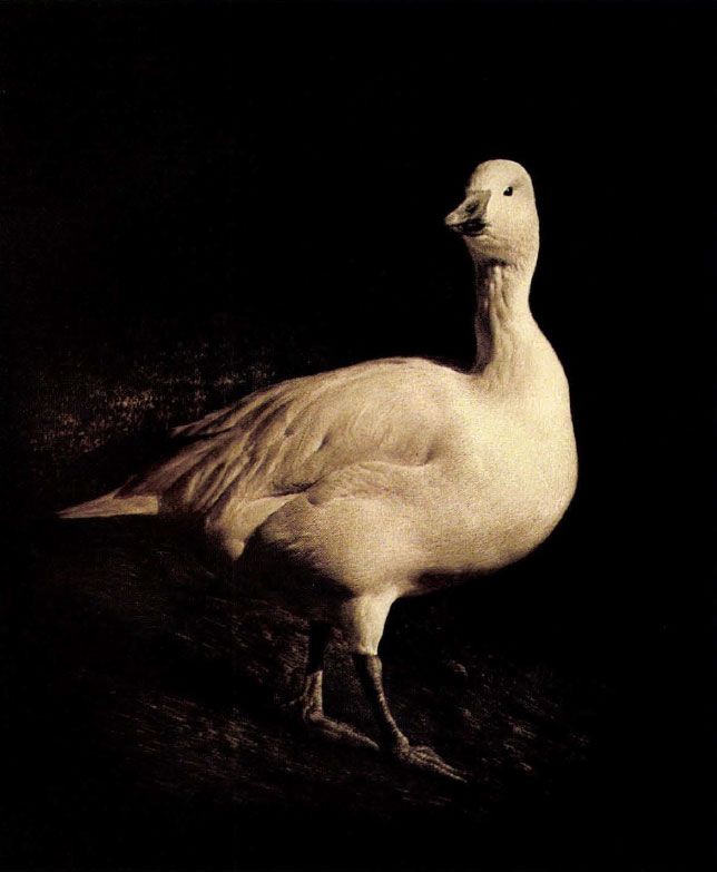
Snow Goose, scratchboard by Alderson Magee
Why choose scratch board as an artistic medium? In my case, I had embarked on a career in the arts after completing a 15-year stint as a worldwide aircraft engine troubleshooter as well as aircraft trade show coordinator. A short-lived adventure into the Byzantine world of dealing in 17th century Dutch art led to a decision to study the techniques of oil painters and watercolorists. Perhaps it was my engineering background that eventually brought me back to scratchboard, a black and white medium that is capable of exhibiting the fullest range of values as well as the finest detail.
In any case, while attending an art show where some of my oil paintings were on display, I saw several examples of scratch board drawings. Immediately I was fascinated by the artist’s ability to capture dramatic lighting effects. I purchased some of the scratch board material on the spot and began what has become a 21-year exploration of its possibilities.
Scratchboard, an invention of the mid-19th century, consists of a smooth, pure white gesso layer, normally covered with a dense black India ink surface. As a result, each cut into its surface with an engraver’s tool produces a white line that can be finer than a human hair.
Working in this medium is not easy. Since the image is engraved into the surface of the artwork, mistakes defy correction. Further, the artist must pay close attention to light values in order to communicate form and mood.
Early on I found that scratch board was remarkably suited to depicting fur and feathers. As a result, the main body of my work has been comprised of wildlife, though I have also used the medium to advantage for artistic excursions into the worlds of railroading and aviation. All in all, working in scratch board has been both challenging and immensely rewarding.
Batik by Beth Erlund
Batik is at least 2,000 years old and has been maintained as an art form in Egypt, China, Japan and Indonesia. Batik-making is a process of producing a design with the use of resists and dyes. Hot wax is the traditional resist and is applied with a tjaunting, a small brass cap mounted on a wooden handle. The dyes can only be used on natural fibers. The waxing and dying process is repeated, working from the lightest color to the darkest until the design is complete. Then, most of the wax is removed. The picture that is revealed is a combination of careful planning, technical and artistic craftsmanship, and the unpredictable character of batik in the form of “crackle,” the fine lines that randomly occur when the wax cracks and dye is allowed to seep into them.
Elk, batik by Beth Erlund.
After graduating from Louisiana State University, I started painting in both oils and acrylics as a hobby. The turning point in my career came when I moved to Okinawa, Japan, where I spent two and one-half years exploring many of the Oriental art forms. Eventually I fell in love with batik, primarily because of its never-ending challenges in both design and color.
Doing wildlife in batik is even more challenging because it doesn’t allow you to put in fine lines. For example, you can’t draw in every single featherlike you can in other mediums. Still, I strive to impart enough detail so the animal is recognizable and realistic. A lot of batikists produce good designs with just a few colors, but I will dye apiece 30 to 50 times to achieve the detail I want.
Original Printmaking by Dennis Curry
The quality of a line of pencil or ink on paper has always held magic for me. This led me into a life of drawing and more than 22 years as a printmaker. Most prints are photo-mechanically reproduced from another medium using a color dot pattern. Original prints, however, are printed one color at a time with a continuous tone process. As a result, each is an original work of art.
In original printmaking, the image is created on one or more matrixes, or plates, rather than directly onto paper. One of my favorites is drawing on a drafting mylar that is then used to carry the image to a lithographic plate. It’s challenging to create a plate that will have the desired aesthetic effect when printed.
Companions of Ngorongoro, original lithograph by Dennis Curry.
Once on the press, each plate printed tends to change the values and tonal relationships of what has been printed before. The effect of each plate is determined in the proofing, where one or two impressions are pulled and the results evaluated by the artist. At this point, color may be changed, areas softened, darkened, added or removed. Each change is followed by a new proof to see if the desired effect has been achieved.
It’s like painting with the press — some plates are used as underpainting and some for glazing over colors already printed. This phase can be time-consuming and full of great surprise. For example, I may have started with a plate I thought should be red and ended up printing it in green.
I experience a great thrill as the image begins to emerge in its final form on fine cotton paper. As with most printmaking techniques, the matrix is the reverse of how it will be printed without color. I look at the fulfillment of an idea I have only imagined, thinking of all the different choices I could have made in creating the plates, or in the printing, and my excitement begins to grow about the next image.
Pastel by Bryan Moon
Having worked in most of the painting media, I am now permanently converted to pastel. It wasn’t a difficult decision. In all the other media, paint is routed from the tube to a palette. Here, a range of say 10 colors are thinned with water, oil or whatever, mixed by palette knife or brush, gathered on the brush or knife and finally make their way to the canvas or paper. The process is so color restrictive and laborious that fatigue sets in by the time the first colors blemish the canvas.
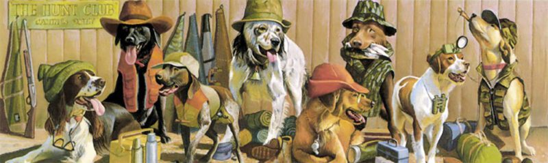
The Hunt Club, pastel by Bryan Moon.
Not so with pastel. I am surrounded by color at the start. Sets of French, Dutch, British and American pastels, about 950 colors in all, are ready to go. Many I would never have mixed from my modest palette selection. Better still, the “painting” hand selects the color and goes directly to the paper or card. Any mixing of color takes place directly on the finished art. This provides an immediacy and spontaneity common only to pastel.
If there is any doubt about the medium either in its artistic potential or longevity, take a look at the French Impressionists, especially Degas. And finally, at the end of a session, the pastelist walks away without any messy palettes or brushes to clean. So nothing intrudes on the pastel artist’s happy hour. Pastel is a very considerate medium.
Editor’s Note: This article originally appeared in the 1992 Sept./Oct. issue of Sporting Classics.
 The Sporting Life is a celebration of gundogs and horses, hunting and fishing as expressed through the rich and exuberant paintings of Joseph Sulkowski. Buy Now