The most profound influence on color, of course, is light. Without it, a prism is little more than a chunk of glass.
Northern tribes like the Inuit have many words to describe what most of us simply call “snow.” The irony of such a vocabulary lapse — one English moniker tidily summarizing a complex and changing element that Arctic natives live with almost daily -would not be lost on the artist when dealing with color. Ask the layman to identify the colors in say, a wintertime male cardinal, and the invariable answer will be “red.” An occasional “crimson” or “scarlet” may pop up if you stumble onto a wildlife photographer, or someone who wants to drag their vocabulary around a little. The artist, however, has been trained, or trained himself, to “see” color. Pose the cardinal question to him and the answers will broaden. The cardinal at sunset may be orange or even yellow. Tuck the bird in a shaded pine, and the artist may tell you he’s brown, perhaps purple. Change the type of light, time of day, atmosphere or distance, and the painter’s color picks would expand even further.
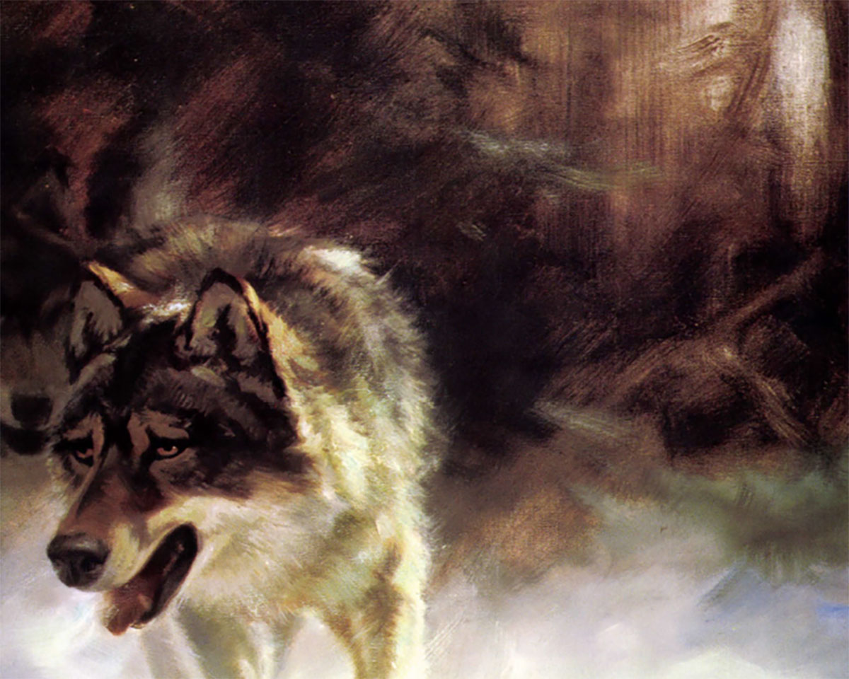
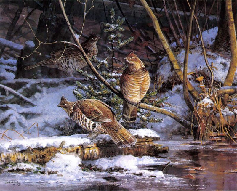
Wilhelm Goebel’s Close to Cover.
Naturally, not all artists see the same colors in the same scene. Nor would they interpret, and thus paint, them the same way. The artist’s knowledge and use of color is often what makes his or her work succeed or relegates it to the ranks of the also-rans. How important is the use of color to the painter? One successful artist I know claims, “you can have great ideas about design and composition, but if you have no color sense, you have nothing.” Another told me that in his art school, color was considered so important that students weren’t allowed to touch it during their first year of training. A final example concerns Monet himself, who according to his biographers, was so sensitive to color that he could tell the exact time of day by observing the hues on the wall opposite his studio window.
Modern wildlife painters strive for such a color sense, training themselves first to see the range of colors in rock and tree, sky and landscape, bird and mammal, and then to mix those hues and tones on canvas with their personal vision. The diverse approaches to color of some modern artists follow — and serve to remind us that the struggle to understand color, begun long before the great masters, is ongoing.
The most profound influence on color, of course, is light. Without it, a prism is little more than a chunk of glass. Throughout the day, sunlight affects color in myriad ways. Most artists prefer the lighting of early morning or late evening, when colors are soft, shadows long and tones warm. New Jersey artist Wilhelm Goebel speaks for many of his contemporaries when he says, “I enjoy painting the ‘golden glow’ of morning and evening light. Midday shadows are often too harsh, and a high sun tends to wash out colors. That first or last hour of daylight creates such a dramatic back or low lighting. I really enjoy that, and it seems to be appreciated by viewers.” There’s also a practical element to the golden glow: “animals and birds are usually more active at those times,” Goebel notes.
Using that golden glow is certainly nothing new in the world of fine art. The term fairly reeks of Romanticism: the era that set Nature on a pedestal, or at least spelled it in capital letters. Could that influence remain in modern wildlife painting? Michigan realist Kalon Baughan admits that he’s been influenced by the “Illuminists,” a group of painters of the American Romantic movement whose paintings showed nature nearly deified in warm, glowing light. “I’m not interested in idealizing nature,” Kalon says, “but I do feel my paintings have a glow to them. They’re a cross between what I actually see in nature, and the effects I want to create.”
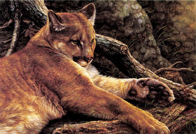
Kalon Baughan used warm colors to convey a relaxed feeling in Silent Repose.
As the sun rises and shadows shorten, sunlight tends to wash out colors and make shadows more severe, or harder. Most painters avoid midday scenes, even if overcast skies have muted the harsh light. Heiner Hertling, a Michigan artist, says that a gloomy, overcast day may “reveal the true shape and color of say, a tree” but robs the painter of the pleasing effect of a warming sun. “If your design or composition isn’t the best, you can throw in a little sunlight and people will say ‘Oh, that’s nice.'”
Hertling says that it takes a skillful artist to create a fine painting of an overcast day. He cites legendary artist Richard Schmid as one of the few who has ever done it well. “Bob Abbett and I were talking about Schmid once,” Heiner remembers. “Bob said, ‘Yeah, Richard is so good he can paint without sunlight: That’s difficult to do, you know.”
Few artists tackle the light/color difficulties of nighttime, but Illinois painter Darrell Bush has enjoyed his few attempts. “One of the challenges of a night scene is to create a light source,” Darrell notes. “Colors separate under light, but those values breakdown in low light; they become harder to distinguish, so you have to add some colors. But if you pump in too much to separate them, the scene becomes unbelievable.”
Bush recently painted a north country canoe camp bathed in campfire light and another scene of a cardinal perched on a yard light at dusk. Getting color values correct in these paintings required a willingness to experiment. “I just mix and match until I feel I get it right,” Darrell quips. “The warmth of the light source against the cool background gives the paintings a warming effect. It evokes a strong emotion in me.”
There are other light and color situations that make painters scratch their heads. The properties of water, for example, redefine light and color in endless ways. John McFaul, a Minnesota artist, says that even atmospheric moisture can affect color dramatically. “I love to paint a morning mist or fog just before the sunburns through. Light filters through that mist and makes colors, well, ‘milky’ isn’t the right word, but it’s the best my vocabulary can do,” John laughs.
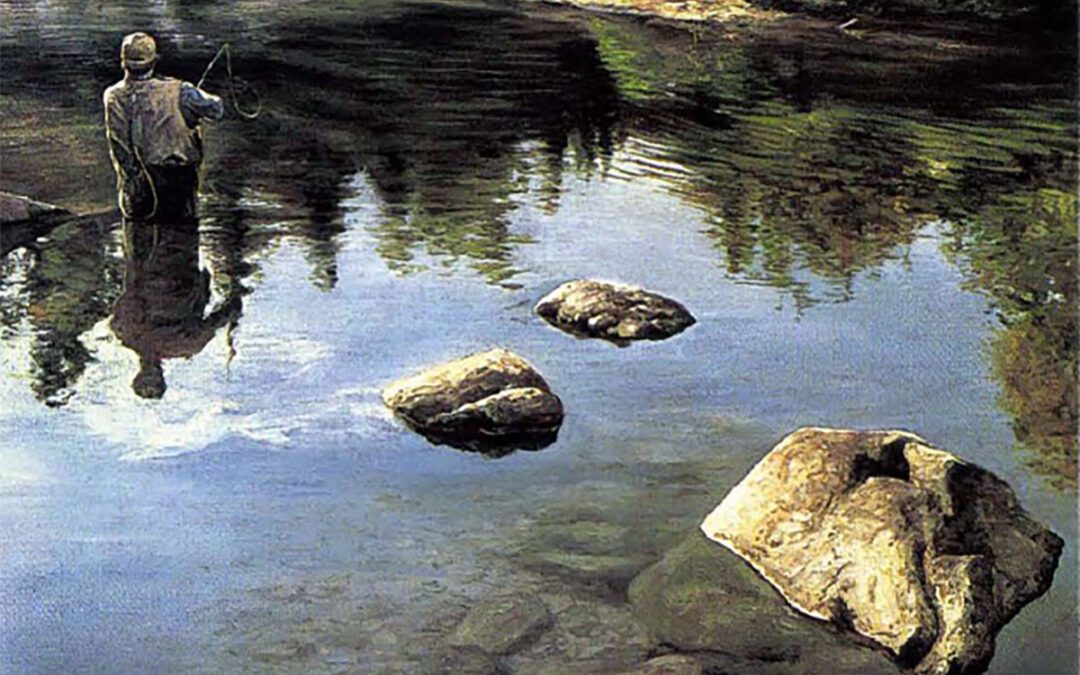
The surface of a lake or river only ups the ante. Adriano Manocchia, known for his stunning looks at flyfishing, says: “Painting water is like dessert for me. Trees, mountains, landscapes … all can become very tedious, but I save the water for last. It may take me two weeks to paint the rest of the piece, but the water will come in a couple of days.
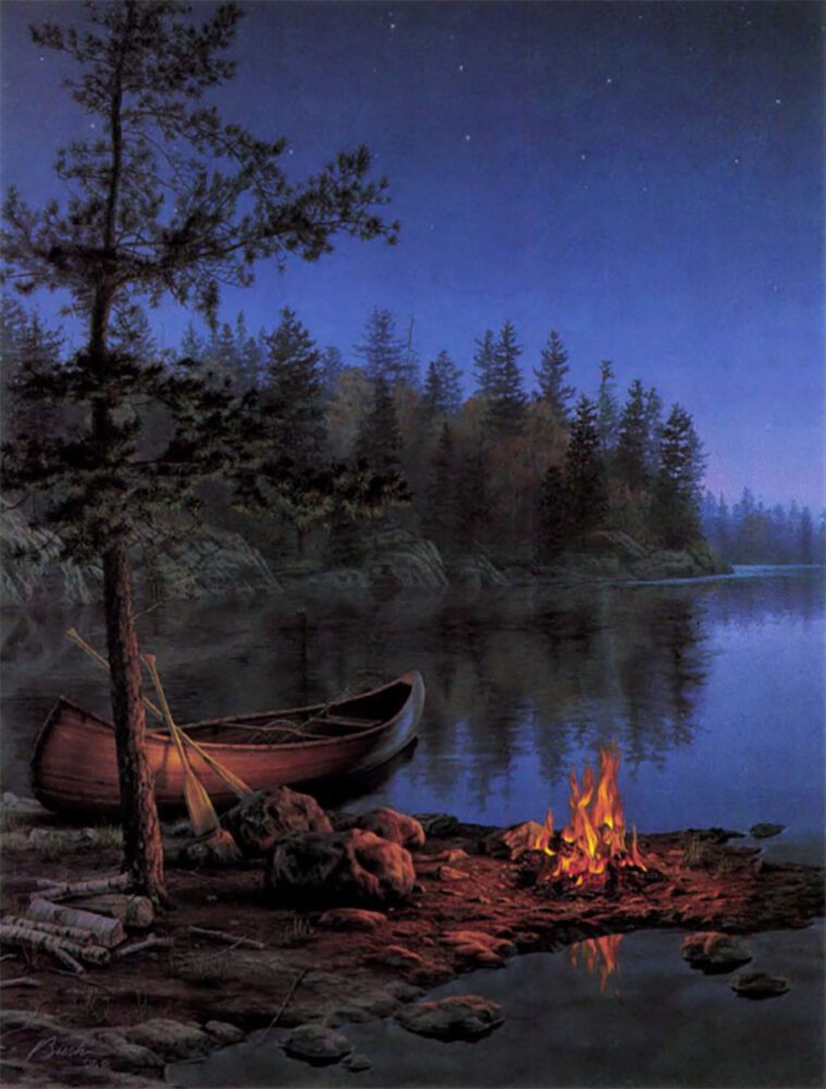
Darrell Bush chose a campfire as his primary light source in Under The Stars.
“The key to painting water,” Adriano adds, “is to show its transparency; to see below the surface, yet still get a sense of its movement. Light plays a big part in that. The colors of water are important, too. Not only there flections of what’s above water, perhaps oranges or browns, but what’s beneath the surface. Sometimes you have to have a lot of guts to blend in those colors. That’s why I usually work water looser and faster.”
While Manocchia paints water as part of the landscape, contemporaries like Wisconsin’s Scott Zoellick produce scenes where water is the landscape. Zoellick’s many gamefish paintings have been successful, he believes, because they mix careful research and artistic license. “I do a lot of diving to gather reference material,” he says, “but if I painted everything the way I saw it down there, it would be boring — dark and murky Fish blend into their surroundings very well.”
Zoellick’s artistic license kicks in when painting the colors of fish in their dark environment. “I tend to portray them from the many years I put in guiding fishermen. I like to paint a fish in the colors you see just as you pull him out of the boat — but just a flash or glimpse of that color.”
If light influences how an artist paints a muskie or bass, it’s doubly important to the painter of birds and mammals. John McFaul says that animals with rich fur, like mink or weasel, often appear striking in sunlight. So are birds with particularly iridescent plumage. “I love the way light hits fur and feathers,” McFaul enthuses. “Wood ducks or rooster pheasants are the most obvious examples of birds with iridescent feathers. But a bird painting doesn’t have to be that dramatic. A grackle in the right light can be incredible.”
Bathe an iridescent bird in a golden glow, and you might have a very saleable painting. The opposite of that situation — a normally colorful animal tucked away in a shadow — poses its own challenges. Wilhelm Goebel notes that “birds like cardinals with bright plumage often lose that brilliance in low light. That extreme fire-engine red is lost to more subtle colors like browns and purples. Such a painting would not be the standard cardinal pose. It could be very interesting, of course, but maybe not very popular.”
Shadow is used by artists to emphasize, or to contrast, both light and color. It’s tempting, of course, to think of shadow as simply dark areas devoid of color. But artists have learned to look into shadows and see the colors they contain. “Once you paint enough,” Heiner Hertling observes, “you realize that the shaded space beneath a tree is not a black hole.” It has deep browns, greens, etc. A good artist learns to see colors where others don’t.”
The colors in Scott Zoellick s Creekside Solitude are accurate, yet compelling.
And how does one teach himself to see color? Plein air painting, coupled with outdoor sketching and note-taking, is one of the most widely accepted methods for learning the hues and tones of nature. Scott Zoellick stresses the importance of plein air painting: “I make it a point to paint outside at least a couple of times a year. You learn first-hand about color and light that way. When you are out there working, you don’t have to second guess yourself about getting it right. Everything is right there in front of you.”
While Zoellick’s comments were echoed by several artists, all admitted that plein air painting can be difficult and sometimes impractical. The camera, then, becomes the perfect tool for capturing an inspiring image and storing it neatly away for future reference. Well, an almost-perfect tool, anyway.
Adriano Manocchia, who was a professional photographer before switching to the paintbrush, explains: “When I made the transition from photography to painting, I knew I had a helpful tool. But the camera can hurt you if you rely on it too much. The best cameras and film can’t capture the subtleties in color and light that the eye can. I was disappointed to find out how much some artists relied on photography.”
The biggest advantage of painting over photography is that the artist can translate his feelings to the viewer. Frank Miller, an Idaho realist who “wants my paintings to copy what nature does,” explains that difference this way. “I’ve shot slides of beautiful scenes like sunsets, and at least part of that grandeur and beauty is due to size. Here, the photo isn’t capable of capturing what nature does. But an artist can sometimes change, or exaggerate, color and light in order to achieve the same effect. If you can accomplish that, you’ve really done something.”
Heiner Hertling created late-in- the-day lighting to heighten the drama in Shiras Shadows.
To create such effects, an artist turns to his arsenal of color — his palette — looking for the pigment or combination of pigments that will produce the colors he wants. Some artists, like Frank Miller, prefer to have as many color choices in front of them as possible and keep their palettes well stocked. “Different situations call for different colors. In reality, nature contains all the primary colors. So if you want to paint realism you have to be able to paint all those subtle differences in color.”
Other painters adopt a less-is-more philosophy, using subtle color differences instead of sharp contrasts. Adriano Manocchia says his palette “consists of fifteen to twenty colors. Sap olive and Winds or green and cerulean and Windsor blue turn up frequently in my work. I think that some artists overemphasize color and ruin the effect of the painting. I like to make the painting warm, and soft and stress color and composition working together.”
Kalon Baughan, who studied with Robert Bateman, also adopts the minimalist view. “Bateman taught mean approach he calls ‘saving you race’,” Kalon reflects. “He feels that the darkest darks and the lightest lights are the most dramatic colors and shouldn’t be used until the end, or unless they’re really needed. Let’s say you’ve created a subject that needs distancing from its background. You would do that with those dramatic colors — but if you’ve already used them, you won’t be able to save that painting.”
Dramatic lighting typical of mountain terrain enhances Frank Miller’s High Mountain Peace.
Whether artists stock colors like Binney and Smith stock crayons, or rely on a handful of favorites, it’s their use of these pigments that determine the success of a painting. Show two artists the same sunset and they may paint it with entirely different colors -or simply choose not to paint it at all. Says Wilhelm Goebel: “I tend to stay away from scenes that are very intense. I rarely paint those very vibrant sunsets that require that straight-out-of-the-tube color. They get so nuclear it’s almost surreal.”
Heiner Hertling agrees. “If I see a cloud formation that’s almost too bizarre and decide to paint it, people will say, ‘Yeah, right; but I saw it. The artist has to use good judgment; there are certain scenes I won’t even try to paint. There’s nothing wrong with knowing your limitations.”
Once an artist selects a scene that agrees with his vision, and his palette, he may draw on a wealth of special techniques to achieve the effect he desires. Adriano Manocchia and Kalon Baughan prepare the canvas with several under-layers that make the surface pigments richer and warmer. Manocchia “gessoes the canvas with warm colors like raw umber or burnt sienna that warm up the actual scene.” ‘Baughan relies on “under-paintings that bring up the [final] colors in a way you cannot mix them on a palette; your eye mixes them on the canvas.”
Scott Zoellick notes that even the light the artist works in can affect the final image. “The odds of a painting being shown in the same lighting I painted it in are poor. So I often take the painting outside, or to another room, somewhere where the lighting is different. My main concern is that all the elements — design, composition and color — function together.”
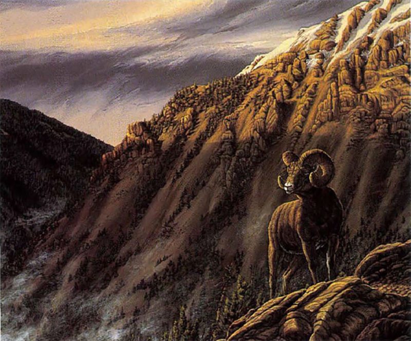
John McFaul’s Payoff – Big Horn Sheep.
Gessoing a canvas, layering colors to give them warmth, taking a painting out of the studio to view it in a different light … some artists regard these techniques as unnecessary But to those striving for the perfect shadow, a warmer orange, a more iridescent feather, they’re just part of understanding, part of the challenge, in capturing light and color.
It’s tempting, after viewing the paintings of these talented artists, to feel they work with color pretty well. But all, I know, would agree with Heiner Hertling, who reminded me that struggling with light and color begins anew in every painting — and an artist never truly arrives. “People have studied this stuff for thousands of years,” he told me. “And there are still so many things to be learned.”
Editor’s Note: This article originally appeared in the 1994 May/June issue of Sporting Classics.
 As exhibited in this section of 150 paintings and in Langmead’s absorbing and enlightening text, The Light Fantastic is a transcendental journey, a 20-year love affair between the artist and the beauty of the natural world. For those who have fallen under the spell of the unspoiled wilderness, and those who yet dream of new journeys, wether they be wildlife enthusiasts or travelers, this is a book to treasure. Buy Now